October 6, 2022
Mobile apps have become a key feature of everyday life, with apps for banking, work, entertainment, communication, transportation, and education, to name a few. But many apps remain inaccessible to people with disabilities who use screen readers or other assistive technologies.
Any person who uses an assistive technology can describe negative experiences with apps that do not provide proper support. For example, screen readers unhelpfully announce “unlabeled button” when they encounter a screen widget without proper information provided by the developer.

We know that apps often lack adequate accessibility, but until now, it has been difficult to get a big picture of mobile app accessibility overall.
How good or bad is the state of mobile app accessibility? What are the common problems? What can be done?
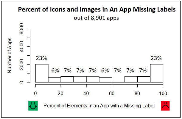
Research led by Ph.D. student Anne Spencer Ross and co-advised by James Fogarty (CREATE Associate Director) and Jacob O. Wobbrock (CREATE Co-Director) has been examining these questions in first-of-their-kind large-scale analyses of mobile app accessibility. Their latest research automatically examined data from approximately 10,000 apps to identify seven common types of accessibility failures. Unfortunately, this analysis found that many apps are highly inaccessible. For example, 23% of the analyzed apps failed to provide accessibility metadata, known as a “content description,” for more than 90% of their image-based buttons. The functionality of those buttons will therefore be inaccessible when using a screen reader.

Clearly, we need better approaches to ensuring all apps are accessible. This research has also shown that large-scale data can help identify reasons why such labeling failures occur. For example, “floating action buttons” are a relatively new Android element that typically present a commonly-used command as an image-button floating atop other elements. Our analyses found that 93% of such buttons lacked a content description, so they were even more likely than other buttons to be inaccessible. By examining this issue closely, Ross and her advisors found that commonly used software development tools do not detect this error. In addition to highlighting accessibility failures in individual apps, results like these suggest that identifying and addressing underlying failures in common developer tools can improve the accessibility of many apps.
Next, the researchers aim to detect a greater variety of accessibility failures and to include longitudinal analyses over time. Eventually, they hope to paint a complete picture of mobile app accessibility at scale.