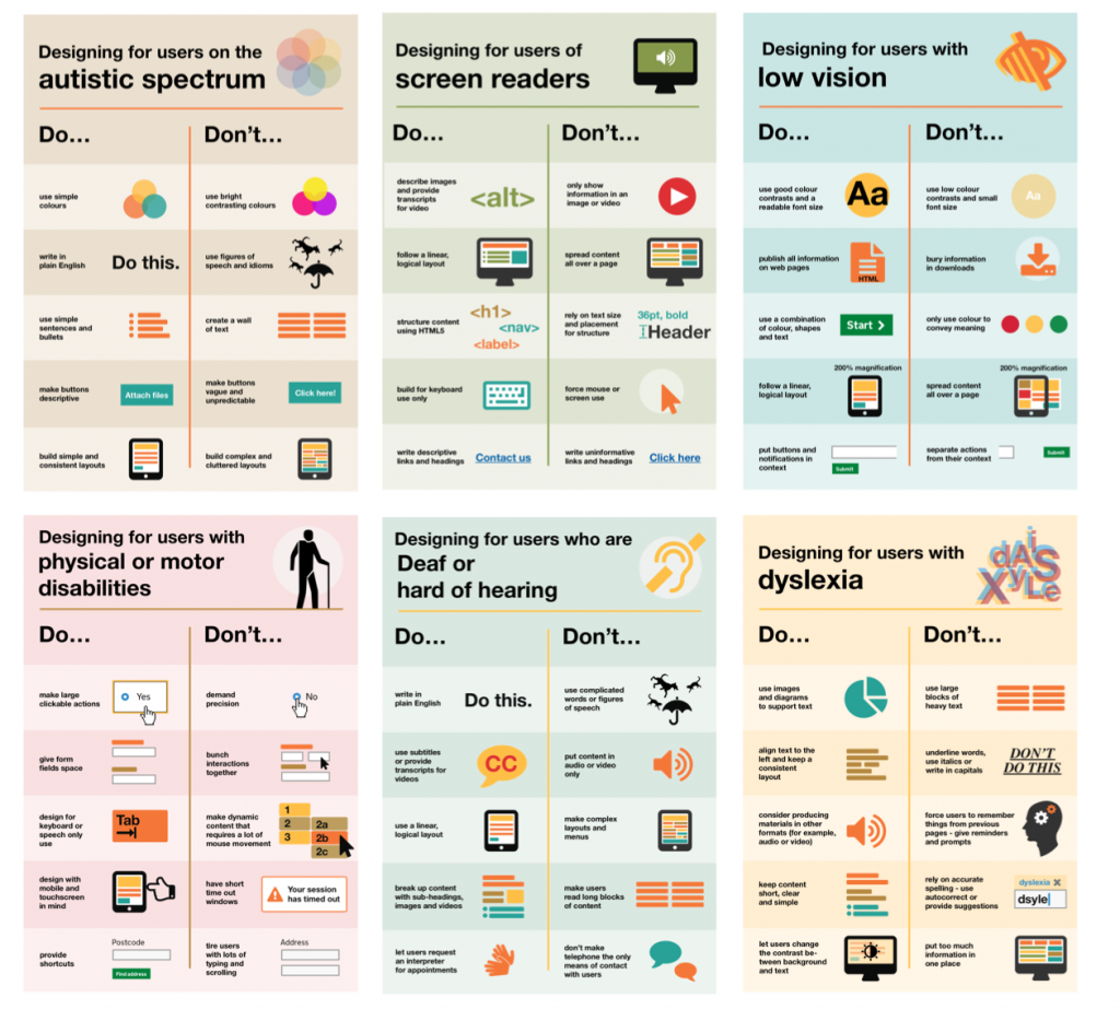
For those designing anything, gov.uk has published best design practices for making services accessible. Each of the six posters identifies the do’s and don’ts for users’ needs:
- Low vision
- D/deaf and hard of hearing
- Dyslexia
- Motor disabilities
- Users on the autistic spectrum
- Users of screen readers
Note that, while the posters themselves are visual and not accessible, the uk.gov web page includes a section, What the Posters Say, that repeats the content in plain text.
