PowerPoint has easy ways to check and add accessibility features. For example, Check Accessibility and Selection/Reading Order are the two primary tools for making PowerPoint slides accessible. You don’t need to discard your old slides. Instead, you can simply change or add some features.
Start with PowerPoint Accessibility Tools, then continue with these tips and detailed instructions to make PowerPoint slides accessible to blind and low-vision users:
- Include alt text on images
- Mark images as decorative
- Group related images
- Make animation accessible
- Add LaTex for math notations
- Represent Flowcharts and Graphs with Mermaid
- Create tactile graphics
Include alternative text on images
Alternative text (alt text) conveys the “why” of the image as it relates to the content of a document or webpage. It is read aloud to users by screen reader software, and it is indexed by search engines. It also displays on the page if the image fails to load, as in this example of a missing image.
See the Diagram Center’s guide on writing good image descriptions.
Missing alt text is a common barrier for PowerPoint users with visual impairment. Make sure you add alt text to any important graphics. When we checked accessibility earlier, you might have noticed that many images are missing alt text in the Check Accessibility panel. We will now show how to add alt text in different scenarios.
How to add alt text
1. In PowerPoint, right-click a picture and find View Alt Text.
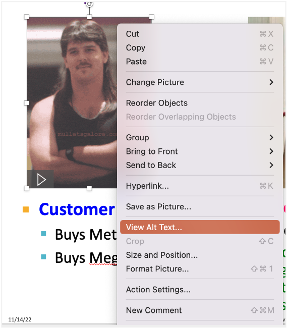
2. Write and edit the alt text.
The Alt Text pane will show up on the right. Add a description that conveys the meaning of the image.
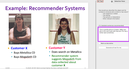
3. Make your alt text descriptive.
It is important to make your alt text descriptive and specific. For example, the alt text above “This is a profile picture of a classic 1980s man who is into rock music with long hair” detailed the picture pretty well. In contrast, you shouldn’t simply say “Customer X”.
See the Diagram Center’s guide on writing good image descriptions.
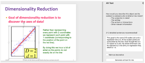
4. Avoid unnecessarily long alt text.
Alt text shouldn’t be long. Consider the point were you trying to get across and use this to help you select the details to include. In the example below, for the scatter plot and red line, we actually don’t care about the number of points or the color of these points or lines. We want to convey that the line is the singular vector that captures the most variance of these points, meaning that the line is aligned with the points in 2D space.
5. Include tactile graphics when possible.
Complement graphs with tactile graphics when possible. For the dimensionality reduction example, it may be beneficial to add tactile graphics so that the students can “feel” what you are talking about. See Create Tactile Graphics.
Use caution with automatic alt text generation
When adding alt text to images in PowerPoint, you might have noticed a Generate alt text for me button. While this feature can be convenient, we advise caution when using it. It’s essential to understand that this function, in its current form, does NOT always produce accurate or comprehensive alt text. Nevertheless, we will guide you on how to utilize this tool and subsequently review the auto-generated alt text for accuracy.
1. Click the Generate alt text for me button.
View Alt Text … → Go to the Alt Text panel → Generate alt text for me
2. Review the generated alt text.
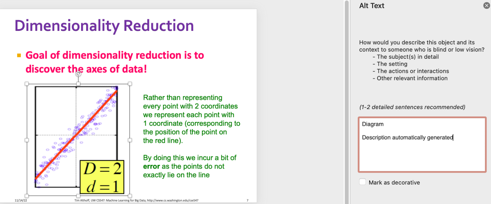
Note that the quality of alt text is not guaranteed, so please do not just click that button and call it a day. If I generate the alt text automatically for the plot, it’ll just show a non-descriptive text, “Diagram”, which is not informative at all.
Language models and alt text generation
We recommend not using tools like GPT4 to generate alt-text. These models often produce very verbose text descriptions and may get numerical values incorrect. We highly recommend taking a very close look, and manually verifying the alt-text if a generative AI program is used to generate them.
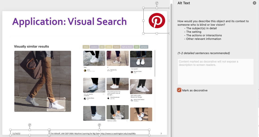
Mark unimportant images as decorative
Decorative images are images that do not convey any information. Think of a background image that simply serves an aesthetic purpose. In this case, you can mark the image as decorative so that screen readers will skip it. Otherwise, the screenreader will focus on and read out the element, confusing the screenreader users. The mistake is especially problematic when the slides contain many of these elements.
In the example below (and for the purpose of this guide), the Pinterest logo doesn’t convey important information, so it should be marked as decorative.
To mark an image as decorative: View Alt Text … → Go to the Alt Text panel → Mark as decorative
Remember footers!
In the example above, there’s also a template footer that specifies the date, instructor, course title, and URL. We advise to mark them as decorative on subsequent slides to prevent redundancy. This ensures that screen readers don’t repetitively read out the same information, thus saving the user’s time.
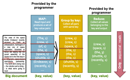
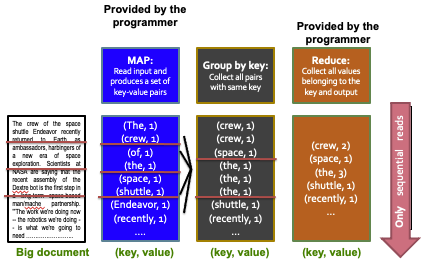
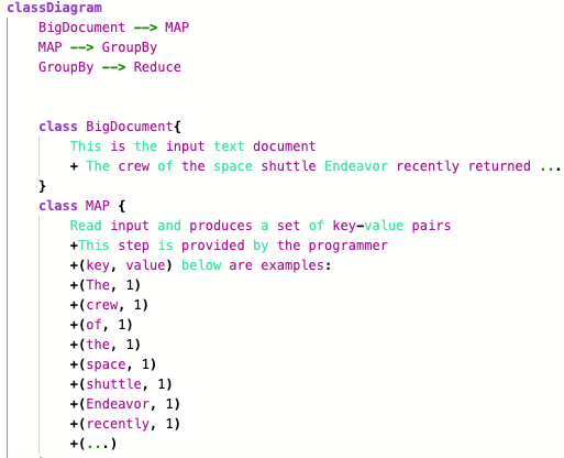
Group images on PowerPoint slides
For complex diagrams with many sub-images, if you don’t group the pictures, the screen reader users will likely (and unnecessarily) be overwhelmed and confused. This page includes two approaches to group images on PowerPoint.
Why group images?
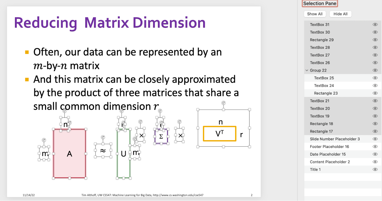
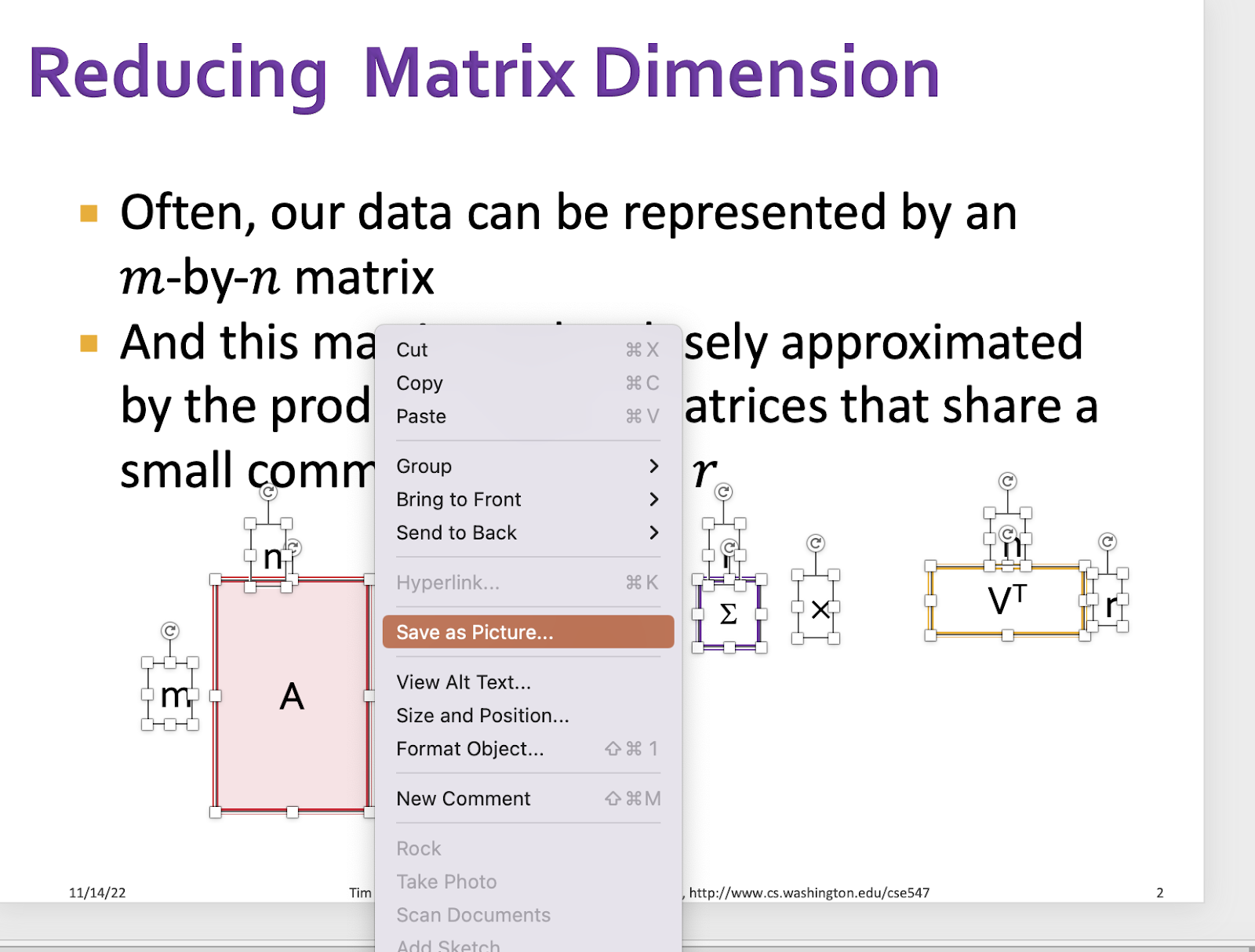
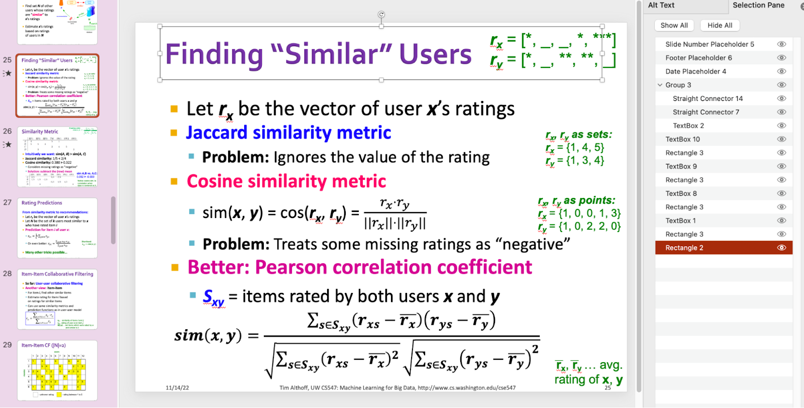
Let’s walk through the example below about Singular Value Decomposition (SVD). As you can see it’s an SVD equation, A=UΣVT, but there are just so many unorganized pointers such as m rows, n columns, approximation sign (≈), r columns/rows, etc. You can see the messiness on the slide’s Selection Pane below. Note the reading order section; it is important!
There are two ways to resolve this issue…
Approach 1: Group the images on PowerPoint.
1. Select each of the images you want to group.
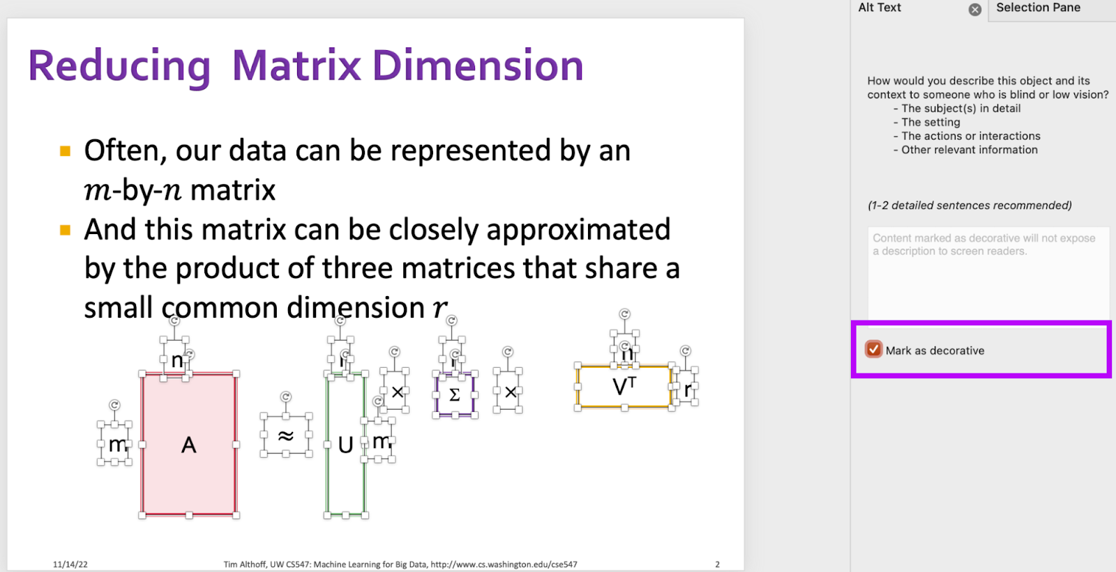
Right-click on the selected images/texts, etc → View Alt Text … → Mark as decorative. By marking them as decorative, the screen reader will streamline its focus onto the entire group rather than each individual element. We want the screen reader to read the grouped content as a cohesive unit. This prevents potential confusion or redundancies, leading to a smoother user experience.
2. Group the components.
Right-click on the selected images/texts, etc → Group → Group. (Yes, “Group” under “Group”.)
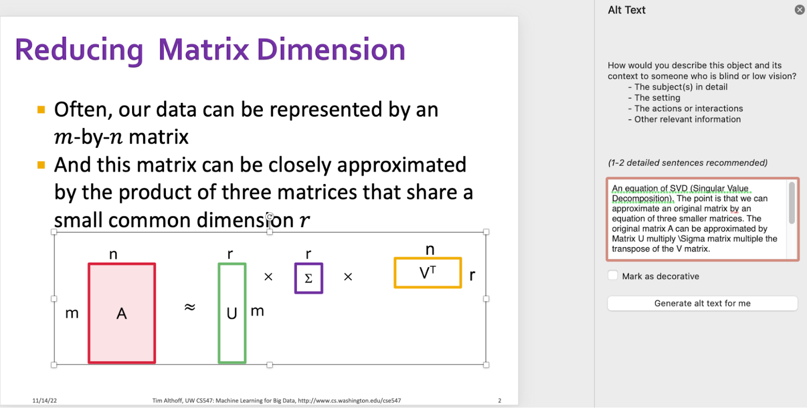
3. Add alt text to the group.
At this step, all the components should be in a group. You need to add alt text to the group.
Approach 2: Save as Picture
1. Select the components and save as picture.
Select the pictures you want to group → Save as Picture …
2. Drag the saved picture from your folder to this slide.
If you want to revert the saved picture to its original position, don’t delete the original components. You can overlay the saved picture with the original components. When they overlap, cut the saved picture → select the original components → delete → paste the saved picture. You are all set now.
3. Add alt text to the picture.
You can add alt text to the new component as an image!
Make animation accessible
It is common to have animation on your slides, but screen reader users rely on the correct reading order and detailed alt text.
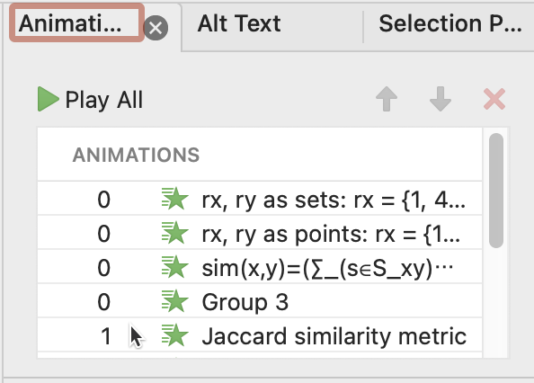
In the example below, the slide sequentially displays the formulas for “Jaccard Similarity Metric,” “Cosine Similarity Metric,” and “Pearson Correlation Coefficient.” With each animation, the corresponding examples (i.e., rz, ry) are revealed in green text on the right-hand side of the slide.
1. Check the reading order.
Make sure that the reading order follows the animation order: the first element in the reading order should be the first element animated. Below is the animation order in the Animation Pane.
2. Avoid adding animation inside of one single text box.
Don’t add animation inside of one single text box. For example, don’t lump all three similarity metrics into one giant text box and add animation inside. Instead, create three text boxes, each of which represents one metric. Having separate components makes it easier to adjust the reading order.
Add LaTex for math notations
Make sure to add LaTex for complex math notation if you just include a screenshot/picture of the math. Some students with visual impairments are able to read LaTex representations. Consider the example about TF-IDF below:
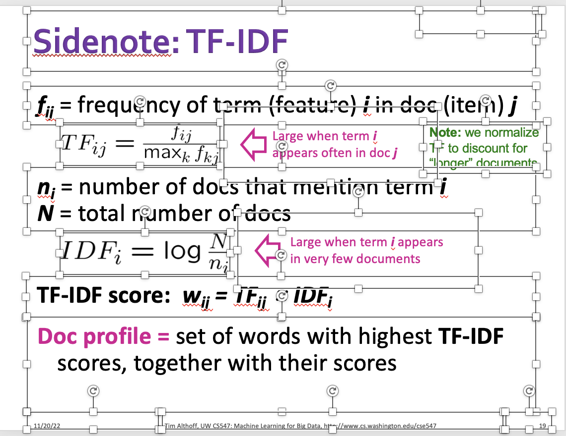
In the example, there are texts, inline math symbols (e.g., ƒij), math equation as one line (see image, right), arrows, and explanation. It involves many components and adding alt text to each single component can be challenging both for the authors and the readers.

To resolve this problem:
- Keep your original slide (yes, regardless of how many components).
- Mark all components decorative.
- Create a new textbox on the side another white box and add your alt text as LaTeX inside the boxto it. This makes the text visible when editing, but invisible when presenting the slides. It also makes sure that the instructor does not easily overlook the content if they need to revise the content. Here’s a rough example of how that would look.


LaTeXiT is a great tool to quickly iterate on the LaTeX formula as you work on your slides.
Represent flowcharts and graphs with Mermaid
Flowchart is a common chart in slides that represents a workflow or process. While you can certainly add detailed text description in your alt text, you can augment your flowchart with Mermaid markdown instead.
With Mermaid markdown you completely specify diagrams and visualizations using text. It is especially beneficial to augment flowcharts. BVI students can read or use the Mermaid declarative grammar found in the alt-text. What we are doing here is transforming graph structure in a declarative format so that screen readers can interact with them. Referring to the Mermaid documentation and the URL to an online playground, let’s look at an example:
We show an image from an original PowerPoint slide. First let’s change the color contrast:
We will add the Mermaid diagram. You can also look at the image that Mermaid compiles A Mermaid-compiled flowchart.
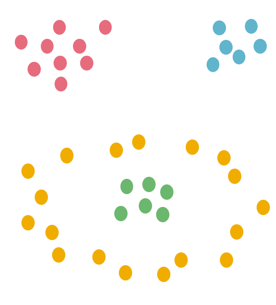
Create tactile graphics
Sometimes alt text might just not be enough, you can reach out to the UW Access Technology Center‘s Braille Embossing services (or the equivalent office at your university or college campus) to print out the tactile graphics of some visualizations. For example, the image below is important to understand clustering. We could rely on alt text, but the tactile experience will augment the experience for blind students.
Planning early is critical
It is expensive and time-consuming to print out tactile graphics, so it typically makes sense to select only images that are essential to understand foundational concepts. Note that in CSE547 we started one quarter in advance — still, not all tactile graphics could be delivered on time during the course the following quarter. This delay might be even longer at other universities.
To create the Braille artifacts:
- Have a folder of the images that you need to print out. Ideally, the image will be in svg format.
- Contact the appropriate office (the UW Access Technology Center‘s Braille Embossing services) indicating that you need help with tactile graphics. They can help facilitate this process.